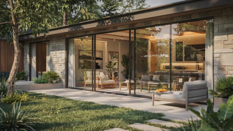
Modern paint choices feel simple until you test them on your walls. Light changes color all day, and undertones can surprise you. The goal is a clean look that still feels warm and lived in.
This guide focuses on colors that work for modern interiors and exteriors. You will learn how to pick the right warm whites, greige, and deeper accents, without regrets. You will also learn finishes, testing, and easy palette planning.
Start with the one decision that matters most
Before you choose a shade, decide what you want your home to feel like. Most modern homes do best with one main neutral, one deep accent, and a consistent trim plan. That keeps the house calm and connected. It also makes furniture and art stand out.
If you pick colors room by room, the house can feel choppy. A simple palette fixes that fast. It also makes touch ups easier later.
Modern whites that look clean, not harsh
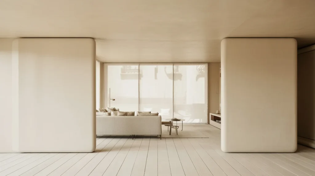
White is the most common modern choice, but not every white looks modern. The best ones feel bright in daylight and soft at night. Pay attention to undertone, not the name on the swatch.
Warm white for whole house walls
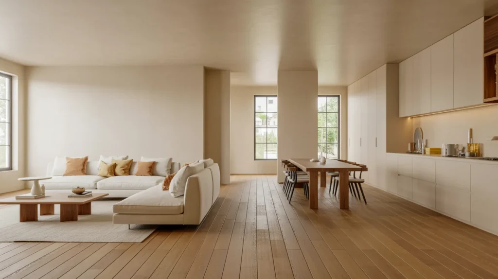
A warm white is a safe base for open plans. It pairs well with white oak, black windows, and natural fabrics. It also hides small wall flaws better than a bright white.
Common problem: your white looks yellow at night. This often comes from warm bulbs and lampshades. Try a more neutral white, or adjust your bulbs to a balanced temperature.
Soft white for a calmer modern feel
A soft white works when you want lower contrast. It is great for bedrooms and living rooms with textured rugs and linen curtains. It feels relaxed but still modern.
Common problem: soft white turns gray in some rooms. That is common in a north facing room, where light is cooler. Choose a warmer undertone, then test it on two walls.
Modern neutrals beyond white
Neutrals are not boring when the undertone is right. Modern neutrals often sit between warm and cool, so they work with more finishes. They also help a home feel grounded.
Greige that stays fresh
Greige is a mix of gray and beige. It works well in modern homes because it supports both warm and cool decor. Pick a greige that looks clean next to your floors and countertops.
Common problem: greige looks muddy on the wall. This usually means the undertone is fighting your fixed finishes. Compare a greige with a green undertone to one with a soft violet lean. One will look clear in your space.
Taupe and beige for warm modern homes
Taupe and modern beige can look sleek when they stay light and clean. Keep the yellow undertone low if you want a modern feel. They pair well with warm woods and creamy tile. They also soften sharp modern lines.
Common problem: beige turns pink or peach. That is an undertone issue, not a paint quality issue. Test a second beige that leans slightly green or neutral. It often fixes the problem.
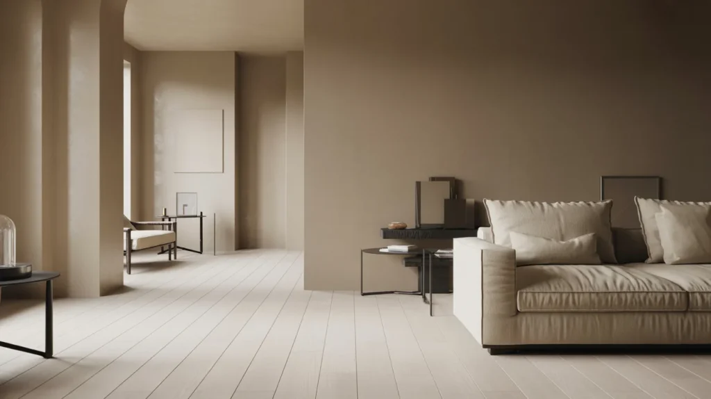
Modern dark paint that feels intentional
Dark colors can look high end in a modern home. They need contrast and good placement. Use dark paint to frame views, highlight art, or add depth.
Charcoal for depth without harshness
Charcoal gives you a moody look with softer edges than pure black. It works on an accent wall, in an office, or behind a media unit. Pair it with light textiles and warm wood.
Common problem: the room feels smaller. Keep the ceiling and most walls light. Use charcoal on one wall, then add a lighter rug for balance.
Off black for doors, trim, and modern contrast
Off black looks modern on interior doors and window frames. It also looks sharp outside with light siding or stucco. Use a finish that can handle fingerprints.
Common problem: dark doors show scuffs fast. Use satin on doors and trim for easier cleaning. Skip flat paint on high touch areas.
Modern greens and earthy tones that still feel timeless
Greens and earthy shades are popular because they feel natural. They pair well with stone, wood, and warm metals. They also keep modern rooms from feeling sterile.
Sage green for calm rooms
Sage green works in bedrooms, kitchens, and living rooms. It suits styles like Japandi and Scandinavian because it feels soft and grounded. It also looks great with warm whites on trim.
Common problem: sage looks gray and dull. Choose a sage that has warmth, not a strong gray base. Test it beside your flooring in daylight and evening light.
Olive and moss for richer modern spaces
Olive green and moss green add depth without feeling loud. They work well on cabinets, built ins, and powder room walls. They also pair nicely with brass hardware and walnut tones.
Common problem: deep green feels too heavy. Use it on lower cabinets or one wall only. Keep counters and backsplash light to hold contrast.
Terracotta and clay tones for warmth
Terracotta and clay tones bring warmth to modern rooms. They can lift a dining room or entry without feeling trendy. They work best when the rest of the palette stays simple.
Common problem: the room turns orange. Choose a more muted clay shade. Pair it with warm white and natural wood to calm it down.
Modern blues that stay balanced
Blue can look stunning, but it shifts a lot with lighting. Always test blue in morning light and at night. Small swatches are not enough for blues.
Navy and blue gray for clean contrast
Navy works well in dining rooms, offices, and on exterior accents. A blue gray is softer and often better for bedrooms. Both pair well with warm woods and brass.
Common problem: blue looks purple or teal. That is undertone shift under artificial light. Try a blue with a more grounded base, then retest at night.
Exterior paint colors for a modern house
A modern exterior usually needs three coordinated colors. Use one main body color, one trim color, and one accent. This creates a clean, planned look.
Modern exterior neutrals that work in most climates
A light neutral body color often looks modern and fresh. Soft whites, light greige, and pale taupe are common winners. They also work with stone and wood cladding.
Common problem: the exterior looks too light in full sun. Sun washes color out. Pick a shade one step deeper than your first choice.
Common problem: bright exteriors show dust and stains. If your area is dusty, avoid ultra bright whites. Choose a soft white or light greige for easier upkeep.
Modern accent colors for doors and details
Use a strong accent to sharpen the exterior. Charcoal, off black, deep green, and navy are popular choices for front doors and window frames. Keep the accent limited so it feels modern.
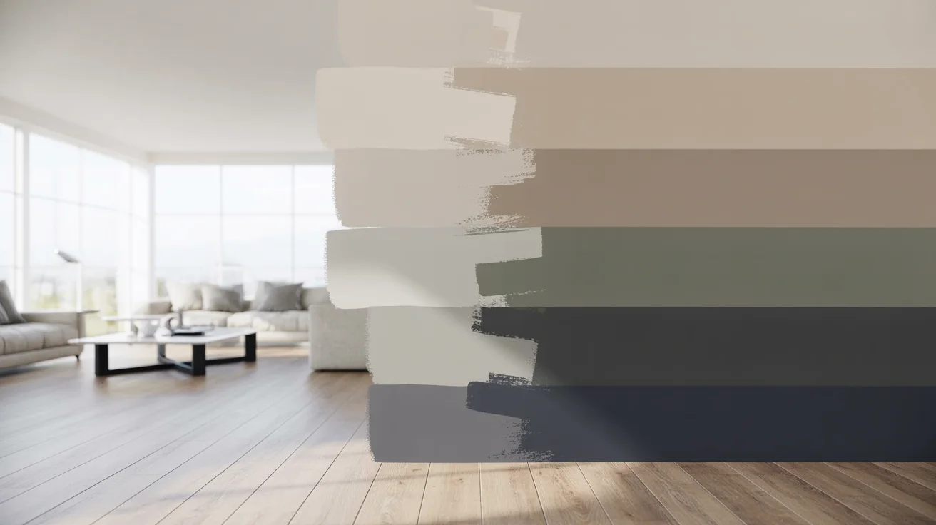
How to build a whole house modern palette
The easiest way to get a modern look is to limit your palette. Pick one main wall color for most rooms. Then choose one deep accent for mood and contrast. Finally, keep trim and ceilings consistent.
A simple flow can look like this. Use a warm white or greige in shared spaces. Use charcoal or navy in one focused room. Use a green tone in a kitchen or bedroom for softness.
Undertones and light direction made simple
Most paint regret comes from undertones. Two colors can look the same on a chip, then look different on the wall. Your room direction and bulb choice drive that change.
Use room direction as a quick test
A north facing room often makes paint look cooler. Warm whites and warmer neutrals usually feel better there. A south facing room adds warmth, so cooler neutrals can balance it.
Match paint to what will not change
Floors, counters, and large furniture set the tone. Paint should support them, not fight them. If your floor is warm, skip icy gray. If your tile is cool, avoid beige that turns pink.
Understand LRV without overthinking it
LRV means Light Reflectance Value. Higher LRV colors bounce more light. Lower LRV colors absorb light and feel deeper. In dark rooms, use low LRV shades as accents, not on every wall.
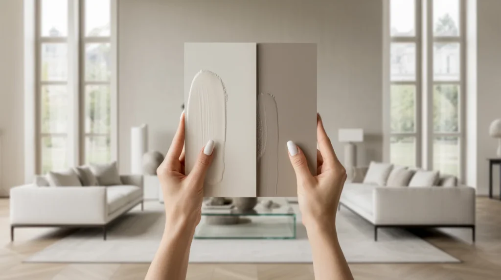
The testing method that prevents expensive mistakes
Paint chips lie because they are too small. Test large swatches on two walls. Check them in morning light, afternoon light, and at night. Give yourself two days before deciding.
Common problem: the sample looked perfect, then felt wrong later. Night lighting is often the reason. Turn on your lamps and overhead lights during the test.
Pick the right paint finish for a modern home
Finish changes the look as much as color. A wrong finish can make walls look shiny and uneven. A good finish makes cleaning easier too.
Wall finishes that look modern and clean
Matte looks modern and soft. It can mark more easily in busy spaces. Eggshell is a safe choice for most rooms. It cleans better while staying low sheen.
Trim and door finishes that survive real life
For trim and doors, use satin or semi gloss. These finishes resist scuffs and fingerprints. They also create a crisp modern frame around walls.
Common mistakes that ruin modern paint results
Many people choose color before fixing lighting. That can cause endless second guessing later. Start with bulbs you like, then test paint.
Another mistake is using too many colors across the house. Modern homes look best with fewer, better choices. Keep one main neutral, one deep accent, and one soft color.
People also forget ceilings and trim. Random trim whites can clash with wall whites. Pick one trim white and use it everywhere.
FAQs
What is the best paint color for a modern house?
A warm white or a clean greige is a strong modern base. Match it to your floors and light before committing.
Are gray walls still modern?
Yes, but avoid icy gray in most homes. Modern grays often lean greige or taupe for warmth.
Is beige replacing gray?
Many homeowners are moving back to warmer neutrals. Beige and tan can look modern when undertones stay clean.
What modern exterior colors work for resale?
Soft whites, greige, and taupe are safe exterior choices. Use charcoal or off black as an accent for modern contrast.
What finish looks most modern on walls?
Matte looks modern and smooth in low traffic rooms. Eggshell is safer for cleaning in family spaces.
How do I stop white paint from looking yellow?
Check your bulbs first. Warm bulbs and yellow shades can shift the wall color. Then test a more neutral white undertone on the wall.